The main features:
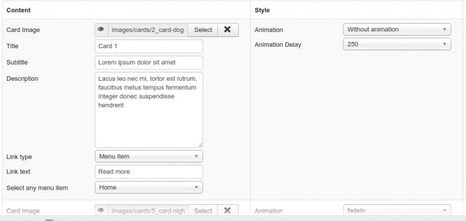
- Cards can contain the images, titles, subtitles, descriptions and links.
- The caption container(optional) has the title and short description.
- Two layout styles - horizontal or vertical
- Two preset styles for images.
- Full customization of all elements - you can change background colors, font size etc.
- All elements of the Card Panel can be animated in the administrator dashboard.
The module is straighforward and easy to use. The Module doesn't require much documentation. Below we have outlined some of the main features and the possible questions which you might have using the extension.
Installation
Install module as any other extension via Extension - Install - Upload Package File or Install From Folder(if you unzipped and uploaded)
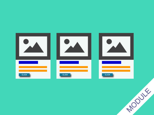
After installing, go to Extensions - Modules and select OK Card Panel from list. The module already has default(most used) parameters and demo data - 3 parallel cards.
You can remove data, remove or add more cards, the limit is 4 cards in one module, it's done this way because the most used layout is parallel cards in row and 1-4 elements are most compatible with all grid systems. Also you can change the order of cards by just dragging and dropping the card.
The module's dashboard except the system tabs has 3 more tabs for configuration(gray ones) - Configuration, Caption and Body, Cards.
Configuration
Layout - you can select the "Parallel" if you use the module in positions above or below content or "Stacked" if you use it in sidebars(it will be as column)
Use Content Container - This option if you use full width of page module position but want to have caption and cards in the centered container. In most cases you don't need to use the container as templates already has its own position container(div). This option is useful if your template has the full width module position (thes positions are mostly used at the top for slideshows) if you want to assign the module to a such position. If you have activated this option the next field "Container Width" appears below and there you can set container width. Leave the field empty for default OrionKit /Uikit container width 1130(1200px minus 35x2 margin), or enter value in pixels, just important without "px" or "pixels", just pure integer value.
Card Border/Shadows – This adds border or shadows with different depths.
Title and Subtitle Wrapper - You can wrap these elements(add translucent background colors) to make it more readable if you have too colorful images.
Image Height - If you have card's images of same aspect ratio leave it blank, but if you have images with different proportions the cards will not look balanced. So using this option you can fix dis-balance by just setting approximate height of the smaller image. To calculate the height it's better to install any ruler plugin to your browser.
In the last fields of the tab Configuration you can change the main colors of cards.
Caption and Body
In this tab you can activate Caption container which has the following options:
Title and Descrtiopin. Both elements can be animated by selection the effect below the fields.
Also you can customize the look of containers. They have the following options:
Change color
Change background color
Add preset background image pattern(has preview on right of fields)
Select the font size and paddings
Add the arrow down or up.
Tip 1 - Don't use too bright pattern image for capture container if use arrow down, and for panel container if use arrow up, as the arrow inherits the color the element but can't inherit background image.
Tip 2 - You can have as many image patterns as wish all you need to do is upload images to the folder mod_ok_cardpanel/assets/images/patterns/ then refresh dashboard and new images will appear in the list.
Tip 3 – it's recommended to hide System Title(first tab - “Show Title” field) if you use Caption container as it doesn't look good - System Title and module own title container.
Cards
You can select two styles to display the cards.
1. Default style - is a rectangular image with the title and hidden subtitle on it. When you mouse over the image the subtitle appears with the animation effect.
2. Circle Image - it's a popular image style when the image is in the circle. if you select this style, additional setting field for card's top background color will appear below the field .
Note: Using this style your images should be square(recommended aspect ratio 1:1) or close to this ratio(for example traditional image aspect ratio 4:3 will be slightly flattened from sides)... In next versions we will try to create a script which allows to use any image.
In this tab you also find a select field "Animation Trigger"
What is the Trigger?
Trigger - is a position(time) when animation starts depending on its position in viewport.
It doesn't affect if your cards are in the screen viewport when the page loaded as animation starts automatically. It's only for elements which are out of screen and works when you scroll the page and they appear in viewport.
The values mean:
"Start" - starts when even a pixel of the card will appear in viewport
“End” - starts when the whole element is in viewport(useful for small cards as allows to scroll when the whole element is in the viewport)
Integer value(100,200etc) - when it scrolled the selected value
Note: - Keep in mind that in the mobile screens the viewport can be smaller than your cards, so the script disables your trigger value if it will be bigger than the screen and returns the “Start” option
Tip - don't use "End" option for big elements to avoid long delays.
If you have any questions don't hesitate to ask it in comments section of the site.
